So now that Summoning the Phoenix will soon be out in the world in April, it’s time to update my official author photo. I’m grateful that my friend Donia, with the helpful comments of Alex, took some photos of me with her awesome fancy camera. But there are so many options, and though I narrowed to four, I still cannot decide. So I need your help. Please vote for your favorite in the comments. Thanks!
Below is Option 1 aka Emily with Camellias
Below is Option 2 aka Emily with Red Berries
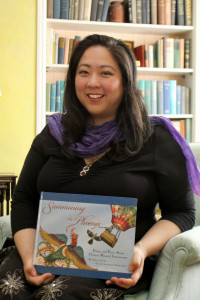
Below is Option 3 aka Emily Holding Her Book Summoning the Phoenix
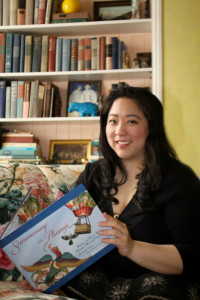
Below is Option 4 aka Emily Reading Book Summoning the Phoenix
And finally, just for laughs, not for serious votes…Emily Rolling Her Eyes at the Absurdity of Getting Her Photo Taken.
Thanks for your thoughts!




I’m torn between 1 and 2. 1 is very natural and relaxed, but the crop is a bit odd with lots of space and your head at the bottom. 2 is a nice crop and a nice smile, but less relaxed… very “Emily” though, which I like 🙂
Option 1 is my favorite because of the touch of color from the flowers, but one could argue that they may overpower you, whereas Option 2 has a higher percentage of you. Option 3 is nice but I don’t think you want something book-specific for your author photo…unless you do. Option 4 is okay. Option 5 exists.
I vote for Option 2. Congrats Emily!!
I like 1 the best, but I can’t tell if it’s slightly blurry. Option 2 seems sharper and may be the best overall. Option 5 is also pretty cute!
Congratulations, Emily! What wonderful news!
I like photo #1, Emily with camellias, best.
The overall light balance in #1 is nice, and makes the colours richer. I like #2, but I think the light is too harsh. You could try jiggering the levels if you have photoshop.
Hmm… I think it depends on the context. If your new author photo is mainly going to go on marketing for adults, like advertisers and booksellers, I feel like Option 2 is the best. It’s nice and professional, and I like the background a little better than in Option 1.
If the marketing on this photo is more going to be oriented toward kids, like on the book cover or a poster in a school or something, I’d say Option 4. A little more quirky, and it looks like you’re about to read the book to the photographer.
My 2c. =)
Option 1. 🙂
Hi Emily,
Option #2 is the best choice – it’s a tight shot and the background is not distracting or busy. Option 5 is fun, but think about what your author picture is communicating. Five is good for your web site but I wouldn’t put it on your book.
Emily,
I like all of them- your second picture is my favorite.
Hard choice! I think I like Emily with Red Berries best. Second choice is the one where you’re reading the book.